HILLY VAN EERTEN, CONTEMPORARY DUTCH WOMAN ARTIST, Amsterdam - The Netherlands
graphic print art / monotypes; for sale & worldwide shipping
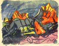
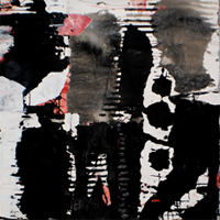
for a short impression of the recent graphic art by contemporary Dutch woman artist Hilly van Eerten, here some pictures of her recent monotypes.
click for more monotype images on the website of Hilly van Eerten
| |
GOOGLE+1 |
|
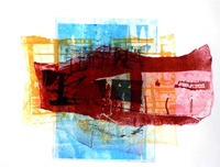
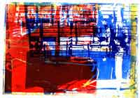
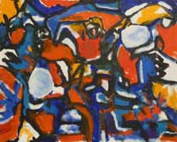
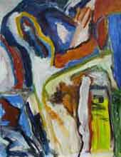
Daniel Meyerplein 2. - monotype on paper, 2007 |
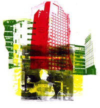
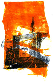
Former Stedelijk Museum, Amsterdam - monotype, 2008 |
|
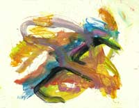
Fishing nets 3. - monotype, 2004 |
Andalucia 3. - monotype, 2007 |
|
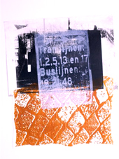
Amsterdam, Central Station 4. - monotype, 2010 |
Public Library, Amsterdam 3. - monotype, 2009 |
|
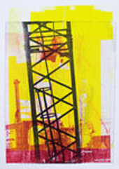
Constructions in Amsterdam 3. - monotype, 2011 |
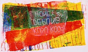
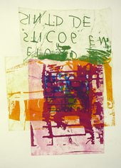
colorful monotype on paper, 2007 |
click for more monotype images on the website of woman artist Hilly van Eerten
Hilly van Eerten - Dutch contemporary woman graphic artist, Amsterdam - The Netherlands
Hilly van Eerten is a born graphic artist from the Netherlands; born, because she thinks and dreams in graphic picture language. This is after all her one and only medium of recent years the monotype! Every form and every image in her work comes alive in the typical language of the graphic artwork: the grain, the different layers of ink, the transparency and covering layers, all are part of the graphic artist’s palette.
Mono-type art
Hilly’s work is based mainly her own photos, which themselves are closely related to graphic language. There are archways, paving stones, roof tiles, fishnets, images of the modern city and architecture. She creates an image closely representing our everyday world of objects, but more structured. This is what Hilly is searching for in her work, a new image in structure. It is the monotype technique that seems to suit her work best during recent years; both black and white as well as in colors.
Where is what
In Hilly van Eerten’s work we note the irrefutable presence of the objects: the street bricks, the roof tiles, the fishnets or a gate. She gives them their characteristic being, as well as the structure in which they occur within the human world. By constant pushing and shoving in her work Hilly van Eerten gives the street brick back its own freedom. The image may, for instance, start to dance with other images; in the digital imaging we are confronted with daily. Or with the images from modern cinema Van Eerten likes to visit frequently. This is how the images in van Eerten’s graphic work enter into new connections and fresh combinations. They play ‘hide and seek’ among the layers of her monotypes and play a game of references. Everything plays out in front of us: where is the front? Where the back? Which is inside and which is outside?
modern city in mono-type
In recent years the modern city has become the main player in her graphic art. Modern buildings from Rotterdam, excavations in Amsterdam city, we can recognize them clearly, but in mixed existence with a mysterious man, or vague reflecting atmospheric lights, or just very solid Dutch bicycles. And always we discover the tales and writings in which the modern city herself tells her daily story. So we meet in her recent graphic art the domain of words and of images, almost inseparably connected. Both worlds are a meaningful language to Hilly van Eerten, so both worlds are worthy enough to be mentioned and represented, so the abstract graphic art becomes a modern visual myth; a tale of the city.
My way of creating mono-type
by Hilly van Eerten
The graphic technique I use is called Monotype because there is only one copy per print. I use only black and white copies for my work, which is slightly different than usual in this technique. I use black and white copies of my photographs as the original for my prints.
I put a glass plate on an even standing table, I apply Gum Arabic to the underside of the copy . I’m working with, using a sponge. I then apply Gum Arabic to the upper side as well in order to cover all the white bits on the copy. I then roll printing ink on to the copy until the black bits on the copy have the colour of the ink I’m using. I then print the copy onto etching paper, using an etching press.
This process has the effect of a rubberstamp print, (a mirror image). If I don’t want my prints to come out mirrored, (texts, for instance). I mirror the original image. Because the results of monotype printing are a bit unpredictable, the print may be a little different from the photocopy.
The photocopy can only be used once.
This technique belongs to the planography techniques because there are no higher or lower lying parts of the material after processing. The parts that are printed are on the same level as the parts that are not printed.
The objects
on the graphic art of Hilly van Eerten, by Fons Heijnsbroek
objects
The world appears to us in objects. They may be complex or very simple. Together they sing the great song of reality as we experience it. Among the great mass of objects there appear to be primal objects. These objects are the ones that have been used by humankind for tens of thousands of years, even in very early cultures that existed unbeknownst to each other. One such primal material is stone as the basis for building houses. The circle, in either symbolic or practical sense, is another. The gate, invented to carry bulk and thus create a passage through a wall. Nets, knives, axes and spear points also belong to this group of objects. These basics are often found in historical excavations as well as in modern time digs.
Hilly van Eerten consciously chooses these basic objects to work with. In her Monotypes series she very clearly demonstrates her choice, the roof tile playing a leading role in one of them. This series shows her fascination with gently sloping and repetitive ceramics and their practical uses: after all, the roof tile is a factory made object designed to shield a house from falling water. This is why the roof tile is shaped in such a way that it may easily be joined to another to close a gap. All of these characteristics are clearly visible in the series. In a different series of Monotypes she uses photographs she’s taken of patterns of paving tiles and bricks. These graphics not only focus on the material, the stone, but also on the various patterns in which the stone has been laid. In these Monotypes we can see the purposely arranged patterns of streets and pavements laid by bricklayers. All of her chosen elements have one thing in common: they are easy to produce. They are only one step in the industrial transformation process: from clay to baked brick, from clump of rock to hewed stone, from iron ore to moulded iron.
It seems as though Hilly van Eerten intuitively looks for the simplest transformations. In her work we can see the solidified work human kind has always been active in: baking, hewing, forging, moulting, moulding.
As though she wants to take us, the public, back to the very matter the earth is made of, and to its transformation into useful objects by human hands. In this sense her work creates a mythology of the human transformation of earth’s elements. They have always been a part of our history as it was brought to us through images of Earth Gods in stories, from the Greek and Norse sagas to Wagner’s Operas. She makes us stop and notice the primary existence of objects and, therefore their steadfastness, their stability. She stabilises the world, the ever flying, moving planet - life - by picking up and using ‘her’ primal objects in her graphic design.
Layers
The first layer in her work consists of picking up and using ‘her’ primal objects almost in that same motion however, she visually taints them. She does not just depict!
The tainting or crushing of the objects is done in the same tough, basic way, as they were created. There is a visual – almost tactile – pushing and shoving. The grain is tainted, it is varied, the thing itself broken, split apart or halved. A physical concrete mill seems to be turning; it is all visual labour that imitates the difficult production process or repeats it from which the objects came. It is no coincidence she uses lithographic technique, etching in copper, or the grain a witness to the process.
She almost always starts a new work with photographs she takes herself. She then chooses whether to Photoshop them or not. Then she copies the photos. This is where the disjointing transformation process usually begins. In this sense her work may be referred to as copy art. However, the physical photocopy disappears and its place is taken by a graphic print. Every print by her hand is therefore unique; ‘Monotype’ is a more appropriate name for her art.
Do we get to see twisted or fragmented objects because she unravels the world into pieces? It is too early to ask that question, because there are more layers to her work, more and more over the years. Almost all of van Eerten’s works have various layers. Some times two or three, other prints may even have six or seven. They can be viewed as layers of processing, layers that are visually stacked very tightly together within one print. The different layers have, as it were, been pressed together with great force so that all space between them has been removed. There is no depth or space in her work – contrary to what layered work is usually about. The squeezed together space in the interior body of the graphic print, brings out a labyrinthine effect: the layers interfere with each other. The result of all this visual labour is that the objects begin to escape their original form. While looking at her prints, our image of the solid ‘brick or tile’ shifts and sort of fades. The heavy, and in our experience, so common identity of the brick disappears. The image is less connected to its being.
Freedom of the visual image
It is because of the objects Hilly van Eerten uses in her graphic art that I am strongly reminded of the great Russian poet Osip Mandelstamm, and his plea for the freedom to move words within a poem. He realised he could only create poetry by allowing the words in his mind to do their own thing. He saw words as abstracts that exist independently of the thing or being they indicate. The word ‘rose’ is not tied to the rose it indicates because the word may also be indicative of a girl called Rose, or even a beautiful thought with that name. The word ‘rose’ is free to roam and play with other words. To Mandelstamm, however, the word doesn’t entirely free itself of the object, because it remembers the object and returns to it now and then. There is a sort of love bond between the word that remembers where it came from and the object itself.
The relationship is never completely severed. What goes for the word, also applies to visual images. Visual images have also liberated themselves from the objects they depict and have gained the freedom to roam in that same way. The question is, do they roam around completely devoid of meaning or are they still connected to the objects they It is because of the objects in the came from? Is there any meaning left?
In Hilly van Eerten’s work we note the irrefutable presence of objects, the street brick, the roof tile, the fishnet. In their characteristic being, as well as in the structure in which they occur within our world. In spite of this the constant pushing and shoving in her work gives the street brick back its freedom of movement. As the word does in Mandelstamm’s poetry. The image of the baked brick may wander, in a poetic sense; it may start dancing before our eyes, creating all sorts of new connections and associations. The image may, for instance start dancing with other images in the digital imaging we are confronted with on a daily basis, or with the images of modern film, in which their freedom is fully utilised. This is how images, used in van Eerten’s work, enter into new connections andcombinations. They play hide and seek among the layers of her prints and play a game of references. Everything plays out in front of us: where is the front? Where the back? Which is inside and which is outside?
Is it still a tile or is it a roof that we’re looking at from above? Has it become a weapon, a sickle? Can we look into it or only at it. Her prints seem to hallucinate kaleidoscopically before our eyes, if we are prepared to look inside, we look into a shifting, circling microcosm, a tight knit world of images, figures and shapes. Sometimes she stretches things to their limit and tests how far she can take it.
Where does the print stop making sense? Is there a limit? Is the cohesion of the print still based on meaning and content or has it turned into a game of aesthetics?
The boundary between where the material remains or is no longer a memory is apparently very clear and very delicate. It seems to be one of the goals in van Eerten’s work, but she only discusses it in images. She does not use words but allows the objects to speak for themselves. Where do the objects completely lose their visibility?
Where are they just visible? She moves along a razor’s edge because she definitely does not want to lose intelligibility altogether. Her choice of firm, intransigent materials helps her accomplish what she wants. After all, they are things that people have known for ever, no matter what part of the world they live in.
To Hilly van Eerten they are anchors, limiting somewhat, the anarchistic movement of the visual roaming. We keep feeling the roof tile in its image. The structure of the pavement and the cobblestones are tangible to our eyes; as are the fishnets with their tatty ropes. We experience their fabricated-ness as we look at them.
The structures, van Eerten consciously uses and varies in her work, remain palpably connected to their stone or fishnet origin. That is the truth of her work; a kind of rubberstamp by which her work can be identified. In spite of her constant and extreme abstracting (from), stripping down and de-boning of images, she is still portraying them. She keeps reminding us of the materials the image is made of. In that there is hardly any imagination in her work. For as we look our feet remain on solid ground. I suspect Hilly van Eerten is constructing a modern mythology of materials, an attempt to carry basic elements from the earth and human history over to the world of modern visual language. She intends to create visual languages and shapes for materials that can participate in today’s world.
She effortlessly competes with digital adaptation, but to date, her work is physical. She shifts, cuts and pastes, varies grain and grid, dampens down or stretches out. Bringing out highlights or pushing images into the background. These are the old methods that have been developed since Seeghers’s time. There is a reason I mention his name. He too utilised the simple basic materials from daily life. They somehow found their way into his work, keeping his exuberant lust to experiment, within limits. What is it that tempts artists to reshape and taint the solid existence of these basic tools? Such as Raveel’s garden fence? Or the cubists’ vases? It may be because the familiar things in daily life show the freedom of the ‘visual image’ so well. The vase, the guitar, Franz Marc’s horses.
We view Hilly van Eerten’s work as a recreation of the fabricated materials in visual images.. The physical transformation that turns clay into brick or iron into a manhole cover is repeated by her, on paper. The visual image however, escapes straight away through the chimney stack. On paper the image returns in the shape of a bird, greeting its origin.
Fons Heijnsbroek.
© Translation, Emmy Muller, September 2008
Curriculum Vitae of Hilly van Eerten, Dutch graphic woman artist, Amsterdam - The Netherlands
Born: 14 juli 1957 in Nijverdal (co. Hellendoorn)
education: 1986-1992 Utrecht School of the Arts
Subject autonomus Graphics department
Exhibitions
2010 MLB Gallery, Amsterdam
2010 Open Studios Jordaan, Amsterdam
2010 Ruimte Gallery, Amsterdam
2010 The Graphic Museum of Friesland, Joure
2009 The Stopera, Amsterdam
2009 Het Glazen Huis,Amsterdam
2009 Oost 99 Gallery, Hoorn
2008 De Opsteker Gallery, Amsterdam
2008 Amstelchurch, Amsterdam
2008 Open Studios Jordaan, Amsterdam
2007 Het Glazen Huis, Amsterdam
2007 Art Store Zus,Amsterdam
2006 Chiellerie, Amsterdam
2005 In images we speak, Amsterdam Graphics Studio, Amsterdam
2005 Orangerie Amstelpark, Amsterdam
2005 Het Glazen Huis Amstelpark, Amsterdam
2005 In images we speak, Gallery Gravura Brasileira, Sao Paulo, Brazilie
2005 Hang Gallery, Amsterdam
2005 Community Service Centre Jacob Obrecht, Amsterdam
2004 Town Hall, Diemen
2004 Open Studios, Amsterdam-Zuid
2003-2004 FNV-Kiem, Amsterdam
2003 Mozes en Aäronchurch, Amsterdam
2003 Plantage Doklaan, Amsterdam
2002 Open Studios Amsterdam-Zuid
2002 Het Nint, Amsterdam
2001-2002 Facta Nova Gallery, Breda
2001-2002 Van Duivenbode, Haarlem
2001 SFB-group, Amsterdam
2001 Arti et Amicitiae,Amsterdam
2000 SER, Den Haag
2000 Beeldkracht Gallery, Scheemda
2000 Open Studios Amsterdam-Zuid
1999-2000 I.C.S., Zwolle
1998-1999 Municipal Harbour Company, Amsterdam
1998 Bloemlust Gallery, Heemskerk
1997-1998 General practicioners’office Zevenhuizen, Apeldoorn
1997 Stichting ABC, Amsterdam
1996 SBK, Amsterdam-Noord
1996 Stadsdeelraadkantoor Buitenveldert, Amsterdam
1996 Dental group offices Pieter Bast, Amsterdam
1995 Leo de Jonge Architects, Rotterdam
1995 Galerie 408, Amsterdam
1995 Central Library, Alkmaar
1995 Open Studios, Amsterdam-Zuid (catalogue)
1994-1995 Fijnhouttheater,Amsterdam
1993 Slotervaart hospital, Amsterdam
1992 Final exam exhibition (catalogue)
1992 Zwolsche Algemene, Nieuwegein
Assignments
Logo design www.Art-Abstract.com
Logo design Stichting Kindertehuizen Nepal
Design invitation to weekend exhibition of fellow-artist
Publications
2010 Artguide for Artists 2010
2008 Schoolcalender
2000 In Artists book Gallery 408
Cooperation projects
1998 Monumentaal in het Klein
1997 Graphics folder
Works owned by
district office, area Buitenveldert, Amsterdam
Albert Heijn, Sarphatistraat Amsterdam
National Economic Council, Den Haag
SFB-group, Amsterdam
AMC, universitairy hospital, Amsterdam
St. Kunst in Onderneming, Amsterdam
Public City Archive of Amsterdam
private owners
YOU ENJOY THE WEBSITE??